BOKA cut the BS campaign
Creative Planning, Design, and Copywriting for my favorite toothpaste brand, BOKA!

What about BOKA toothpaste makes it unique? Why should anyone pick BOKA over trusted fan favorites and cabinet staples like Crest or Colgate?
There is a certain market for super sensitive, health conscious, texture conscious people. This campaign for BOKA toothpaste highlights what sets the brand apart from traditional competitors.
Many people are sensitive to the strong flavors, harsh textures, and chemical aftertaste in products like Colgate, which can even make some physically gag (including myself). Some even resort to using unflavored toothpaste just to avoid the discomfort. Boka stands out by using a clean, gentle formula with nano-hydroxyapatite that protects your teeth without overwhelming the senses.
This campaign focuses on positioning Boka as the go-to option for people who want a healthier, smoother, and more enjoyable brushing experience.

This AD is intended to be placed in a newspaper, a magazine, or some kind of print format. More specifically this AD would be placed in magazines you may read while sitting at a dentist office and waiting to be seen.
The wording of this ad is very intentional in the way it appeals to people who care about natural, safe ingredients. The phrases “Powered by Nature,” “Non-Toxic and Fluoride Free,” and “Free From Harsh Chemicals” directly target consumers who are skeptical of mainstream brands like Colgate that use strong flavors, artificial additives, and fluoride. By using simple, reassuring language like “just clean, natural ingredients,” the ad builds trust and makes the product feel safe and approachable.
The emphasis on words like natural flavors, paraben free, vegan, and cruelty free signals brand transparency and taps into lifestyle values that go beyond oral care. By positioning Boka as gentle and natural, the copy communicates that this product won’t cause health anxiety, but remains just as effective.
I was focusing on framing the brand as an alternative to “chemical-heavy” competitors. Instead of just saying Boka is a toothpaste, the wording makes it clear that it’s for people who care about natural ingredients, health, safety, and comfort, not just cleaning teeth. It shows how language can reframe an everyday product into something that feels more intentional, modern, and aligned with wellness culture.

This version of the campaign takes a completely different tone compared to the softer, nature-focused ad. By opening with the phrase “Cut the bullsh*t…”, the ad immediately grabs attention and feels more raw, bold, and unapologetic. This type of wording is designed to resonate with a younger audience (especially Gen Z and younger Millennials) who are drawn to brands that are direct, transparent, and not afraid to break traditional advertising norms. This ad focuses on transparency and the brand being unapologetically true to itself.
Instead of relying on calm, reassuring language like “powered by nature” or “free from harsh chemicals,” this ad uses shock value to stand out. It challenges the reader with a blunt question “Do you watch what you put in your mouth?” which makes the message harder to ignore. The use of “NO BS” as a design element doubles down on the idea that BOKA is about transparency, and simplicity, values that younger consumers often seek in the brands they choose.
Wording and tone can completely change the audience being targeted. Where the first ad appealed to health-conscious, ingredient-sensitive consumers through trust and natural credibility, this version positions BOKA as a bold, no-nonsense alternative for younger buyers who value authenticity and straightforwardness. It’s about aligning with a cultural attitude that rejects traditional marketing fluff and wants to get straight to the point: “cut the bullsh*t”.

This banner ad targets Gen Z and younger millennial audiences who value health, transparency, and authenticity. It would be placed on sites similar to BuzzFeed, Vice, and YouTube— platforms where bold, unfiltered messaging thrive. It could also appear on e-commerce and wellness sites such as Thrive Market, or Urban Outfitters, where users already seek out clean-ingredient products but appreciate brands with personality.

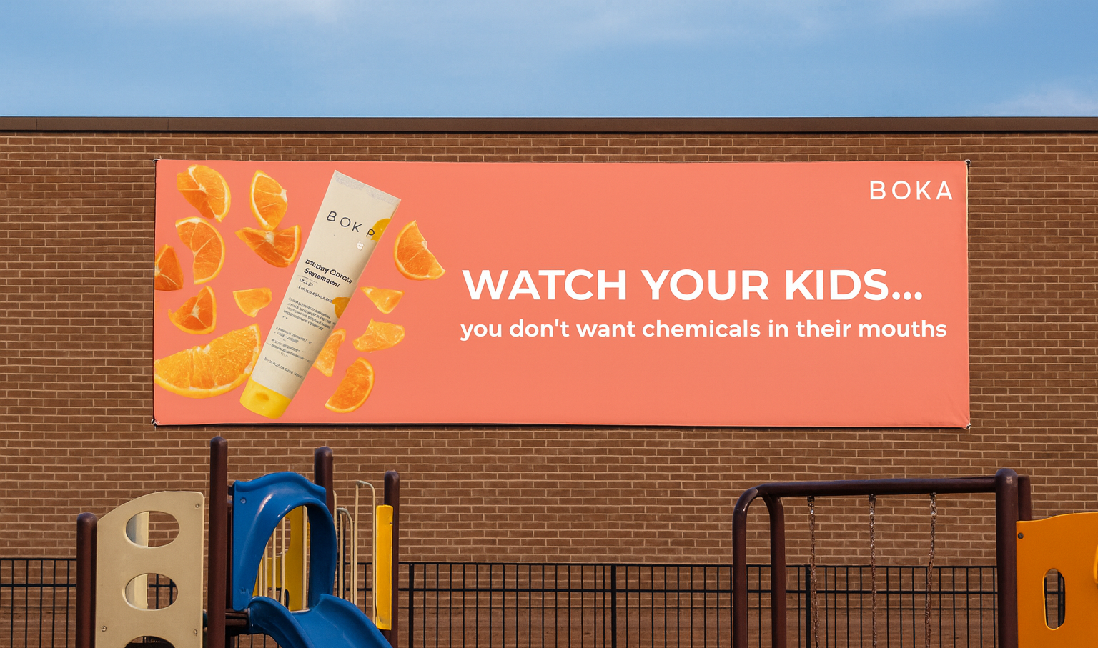
This ad is crafted to target adults, specifically parents, while promoting Boka Kids toothpaste. The wording is direct and slightly alarming, using the statistic “90% of kids swallow toothpaste” to immediately raise concern. By asking the rhetorical question, “Do you really want your kids ingesting chemicals for breakfast?”, the ad reframes an everyday routine as a potential health risk. This approach speaks directly to parents’ protective instincts, making them reconsider the safety of the products their children use.
The headline, “No family member is left out…”, reassures parents that Boka’s clean, fluoride-free formula is designed with the entire household in mind. By highlighting natural extracts, the absence of synthetic dyes, and the replacement of fluoride with nano-hydroxyapatite, the wording emphasizes both safety and effectiveness. This makes Boka feel like the responsible choice, aligning with modern parenting values around wellness, natural living, and reducing exposure to chemicals.
What I was doing with this ad was shifting the tone from playful or edgy to more parent-conscious and health-driven. Unlike the bold “Cut the bullsh*t” ad that appeals to younger buyers, this ad leverages fear of hidden risks and a desire to keep kids safe. It speaks to adults who want reassurance that they are making the healthiest decision for their children, positioning Boka as the trusted, family-friendly alternative to chemical-heavy mainstream brands.

I’d place this billboard in high-traffic urban areas like downtown Chicago, Wrigleyville, West Town, or near college campuses like DePaul where young professionals and students commute daily. These locations capture an audience that values wellness, and minimalism, people who appreciate bold messaging and are open to trying cleaner, more natural products.
The 3D format rejects the flat look of traditional billboards. By making the toothpaste tube pop out and extend beyond the billboard, the ad feels more dynamic and lifelike. This choice ads depth creates curiosity and visual interest. It also reinforces the bold tone of the “Cut the Bullsh*t” message by matching it with equally bold, standout visuals.


This digital bus stop ad uses motion and contrast to capture attention.
The screen alternates between Boka’s clean “Powered by Nature” visual and the bold “Cut the Bullsh*t” message for shock value.
The sliding transition reinforces the brand’s honesty and transparency, first it draws viewers in with simplicity and minimalism, then hits them with attitude and facts.
It’s an engaging way to connect with on-the-go audiences in Chicago (specifically in Armitage) who value authenticity and natural products.

This banner ad would appear on sites trusted by moms seeking natural products for their families, this includes popular clean-ingredient blogs such as Mama Natural, Wellness Mama, & MindBodyGreen sites trusted by moms seeking natural products for their families.

Placing these ads near city playgrounds taps directly into moments when parents are already in “protective mode.” These areas are filled with families who care deeply about their children’s health and daily routines. This ad reminds caregivers that there are other dangers to consider when it comes to their children’s overall wellbeing. In urban environments playgrounds are often surrounded by high foot traffic and apartment buildings, this placement ensures constant parent visibility and everyday repetition. The contrast between the playful setting and the serious message makes it both eye-catching and emotionally resonant, helping Boka stand out as a clean, safe, and parent-approved alternative to traditional toothpastes.